FortyTwo24: A Unique Tasmanian Brand Connecting Local Heritage and Global Appeal
The problem
FortyTwo24 had outgrown its own brand. The business had evolved well past its origins as a heavily regulated, government-adjacent operation — but the brand hadn't followed. It was flat. Stagnant. Built for a version of the company that no longer existed.
Inside the business, there was real energy. A talented local team, genuine passion for the work, and a pipeline of commercial opportunity. But that energy wasn't cohesive. Different parts of the business were pulling in different directions — and none of it was landing externally in any meaningful way.
In their own words: the old FortyTwo24 walked into a room and was "a bit meh." Trusted to get the job done. But forgettable.
"We lack emotion. We need to develop a personality that is more reflective of who we are now and how we want to be perceived in the market."
With a significant marketing push on the horizon, that needed to change — and fast. They couldn't invest in going to market with a brand that didn't reflect where the business was heading.
The approach
We started where we always start — with strategy. Before a single design decision was made, we needed to understand what FortyTwo24 actually stood for, and whether the people inside the business agreed on the answer.
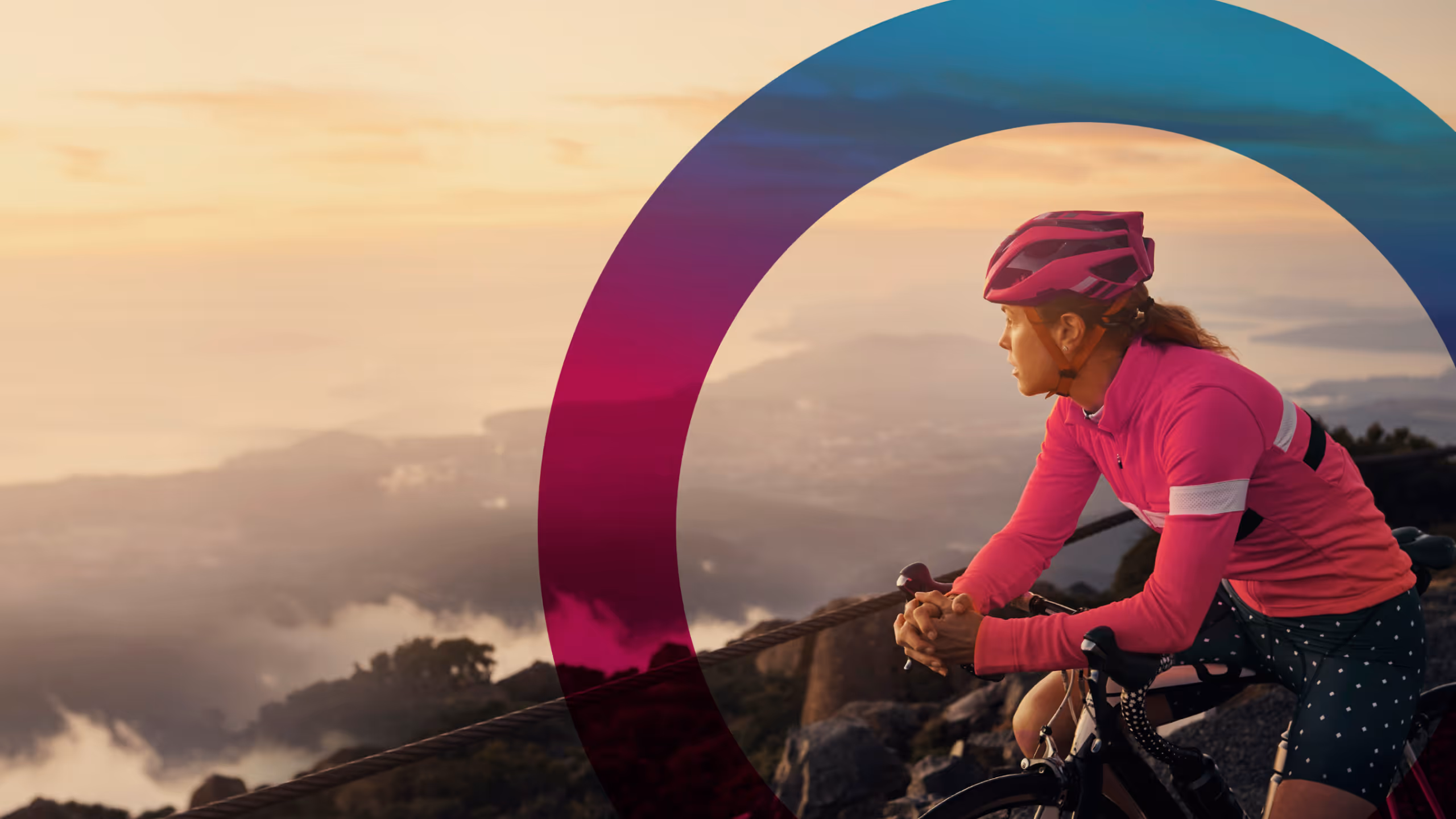
The name itself turned out to be the anchor. 42° south — the central latitude of Tasmania. 24 — always on. It wasn't just a clever alphanumeric; it was a genuine articulation of who they were: a Tasmanian business, deeply local, reliably present. That became the foundation everything else was built on.
From there, we developed a brand model that gave the business a clear purpose, a defined personality, and a tone of voice that felt human — confident and technically credible without being cold or jargon-heavy. The goal was geeky-cool. Expert enough to be trusted. Warm enough to be chosen.
The visual identity followed the strategy — not the other way around. A refreshed logo system, a bold gradient palette, the Degree Device as a flexible brand element rooted in the 42° concept, and an imagery approach that balanced technology with people. Every element had a reason to exist.
Next Project